PACKAGING

ISIDRO COFFEE
DESIGN OVERVIEW: Self-Initiated Passion Project
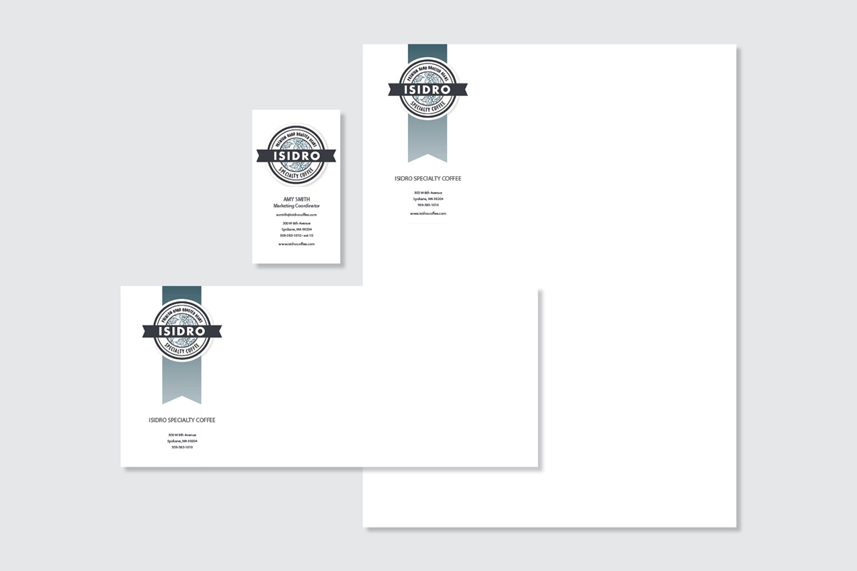
A modern self-promotion branding and package design exercise for a prospective specialty coffee distributor. This exercise created overlapping example imagery for student lessons in branding, package, website, and mockup design.
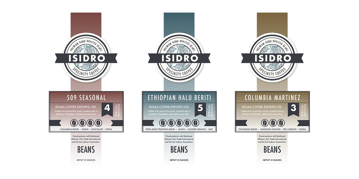
The packaging's clean, crisp white bag contrasts on the shelf with competitors' dark coffee bags, and alludes to the local, family-owned boutique company identity.
The round logo above the label acts as a focal point, surrounded by negative space, to draw the consumer's eye. The label design quickly informs consumers of relevant information; the coffee name, strength, flavors, and the company's ethical and socially responsible industry associations.
LABEL DESIGN
IDENTITY SYSTEM
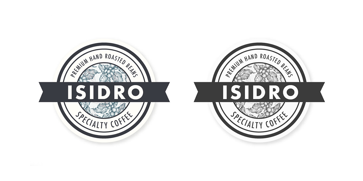
LOGO DESIGN
TYPOGRAPHY
PT SANS REGULAR

PT SANS BOLD

COLOR PALETTE


COASTER DESIGN
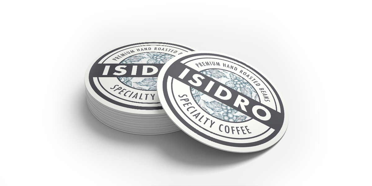
Coasters are letterpress printed by a local printing firm, distributed to all retailers selling Isidro Coffee, and liberally included in all online and local pickup/delivery customer purchases.
WEBSITE DESIGN
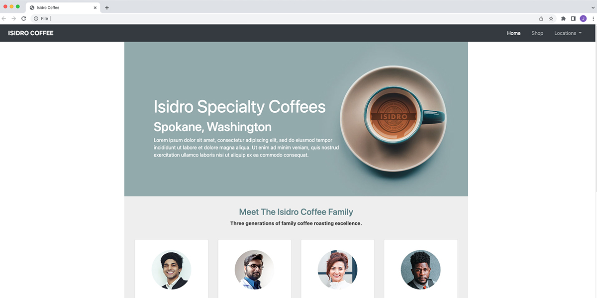
Website mockup design used as a teaching tool with students to learn basic Bootstrap responsive web html/css coding and layout strategies.
Click HERE to view html/css coding lecture pdf.